Welcome! This portfolio is optimised for desktop, but please feel free to have a look here as well.
I build intuitive, functional, and engaging software.
Whether we're starting from scratch on a brand new project or you have a specific gap to fill in your existing user experience, I can transform your broad ideas into reality.
I apply human-centered design principles to stakeholders' requirements to create successful products users can easily navigate and understand. With my background in full-stack software development, I am also able to work closely with engineering teams to discover new solutions and overcome limitations in code.
View some of my key projects below, or download my CV here.


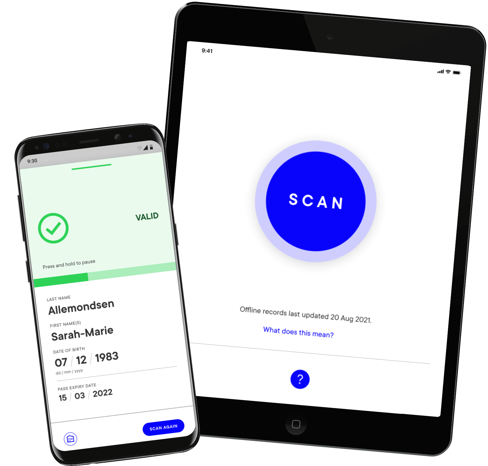
MATTR is a decentralized identity startup in New Zealand. In August 2021, we were contracted to create the NZ Ministry of Health Pass Verifier app, a mobile and tablet app for Android and iOS that verified COVID vaccine passes nationally. The project was given a tight deadline, strongly prioritised accessibility, and highly visible in the media.
I started my research with a competitive analysis of similar apps in other countries. I then identified our potential users based on existing scenarios overseas and the upcoming legislation from the New Zealand government. From there, I developed case studies and personas, which we used to develop our journey map. We presented all of our research to our executive stakeholders and the engineering team for feedback. Once aligned, back-end development began while my UX teammate and I started to design the screens. Throughout, we maintained close contact with the development team to ensure feasibility, bouncing ideas back and forth daily as we progressed.
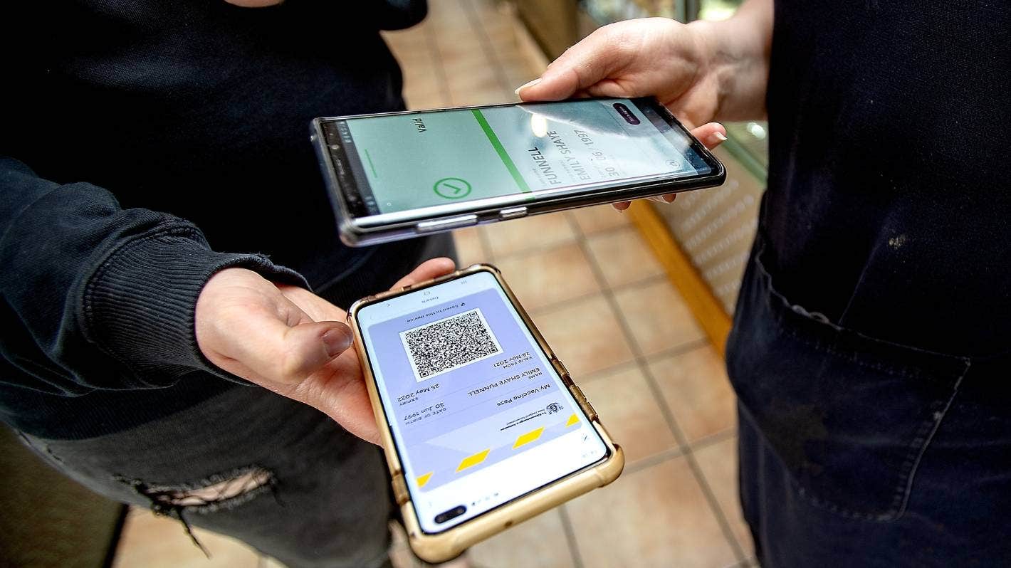
We were also tasked with creating the vaccine passes themselves (shown here, bottom). Because we expected some users to print theirs, it was important that the QR code could be small enough to fit in a wallet, but still large enough that the highly-complex image was readable by a range of devices.
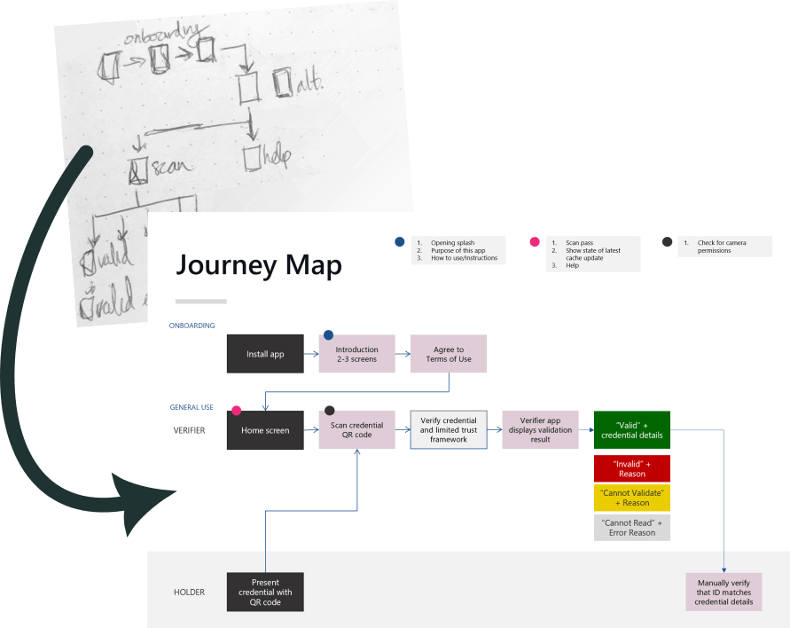
My workflow: the earliest stages of my process are scribbles in my notebook, which I use to augment discussion and research as I refine requirements. Click the image to view a larger version of our final journey map.
People having their passes scanned needed to feel that it was fast, simple, and secure, and we highlighted that face-to-face interaction with holders on our map. We also wanted to ensure a smooth onboarding process for use cases such as a festival where many people were using the app at different gates, so we highlighted the points where instructions were given and device permissions needed to be granted. Throughout development, we referred to this document to ensure alignment, and when the app reached Version 1, we shared it along with this map with our external accessibility advisor team.
I oversaw the accessibility audit against WCAG 2.2 AA. This audit found the app to be 76% conforming on initial review, which we increased to 88% conforming in a second audit one month later. Our accessibility advisor team noted the importance of such high conformity in a government-sponsored, country-wide app: some of our key users ended up being people with disabilities using the app to verify their in-home carers.
Animations were used to bolster interactions within the app. The loading spinner indicated that something was happening while passes were verified, while the countdown bar indicated how much time was left before personal identifying information is hidden. Elements such as results screens slid in the direction of supported gestures to facilitate understanding of how the app could be interacted with. Throughout, consideration was given to ensuring features didn't compromise the speed of scanning, as one of our most common use cases was a large group of customers needing to be scanned into a location.
This video was used to showcase our animations to executive stakeholders. Because it was produced relatively early in development, it uses screens from older prototypes. This is evident when comparing it to the Valid result screen seen above, where we decided to go with a larger green area to make it easier for users to glance at a result when scanning.

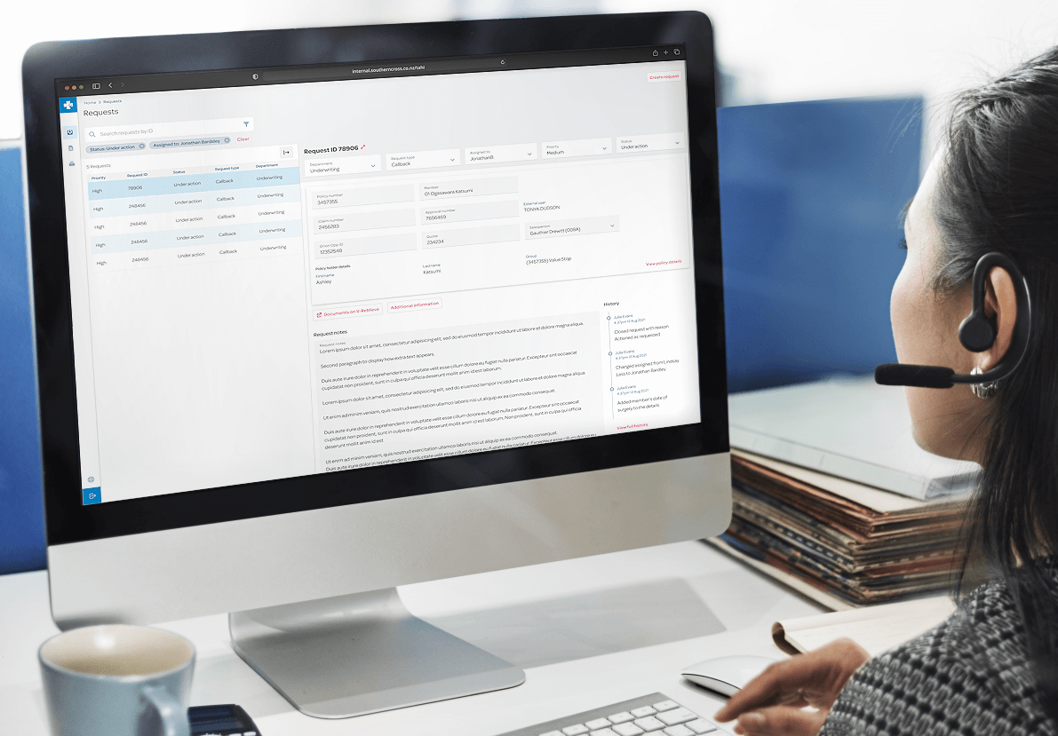
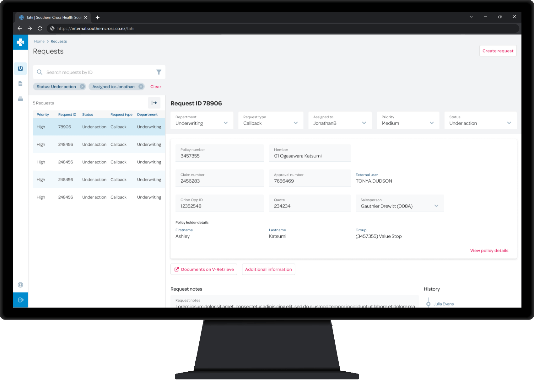
Southern Cross is New Zealand's leading health insurance brand. In 2023, I concluded a year-long contract on the team redeveloping their customer profile management software.
The existing software was a desktop program that was being upgraded to a modernised, browser-based version using React. A key task was to assess the progress to date on both granular and higher levels. We spoke with current users to identify areas in the existing architecture that could be refined, and prioritise what changes they would most appreciate in their daily work. We then worked closely with business leads to get approval for users' top requests (responsiveness and several specific keyboard shortcuts), as well as to propose a refreshed link heirarchy for the project's information architecture.
When we discovered inconsistencies in the use of components across the siloed development teams, my two teammates and I held workshops to improve the process workflow for feedback on design requirements from testing and engineering. An outcome of this was that we prioritised collating several partially-complete libraries from the early stages of the project into one design library. The broad range of colours in use were condensed down to a few palettes, and typography was aligned to better communicate interactivity and importance. This unified branding improved consistency across the project and can be viewed here.
We worked with engineering to implement StoryBook as a single source of truth for developers across all teams, further improving the process workflow between design and development.
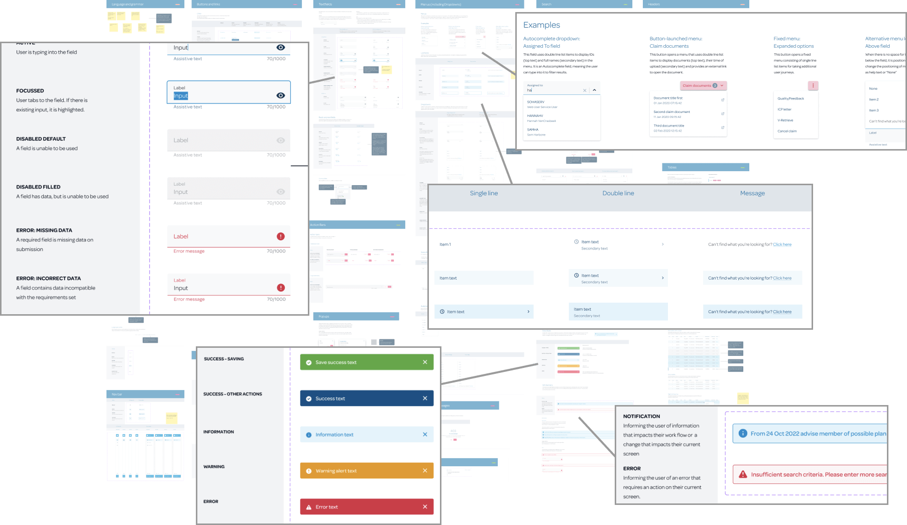
Our design library in one of its earlier stages. Click the callouts to view full pages from the final library. Additional examples include buttons and modals.
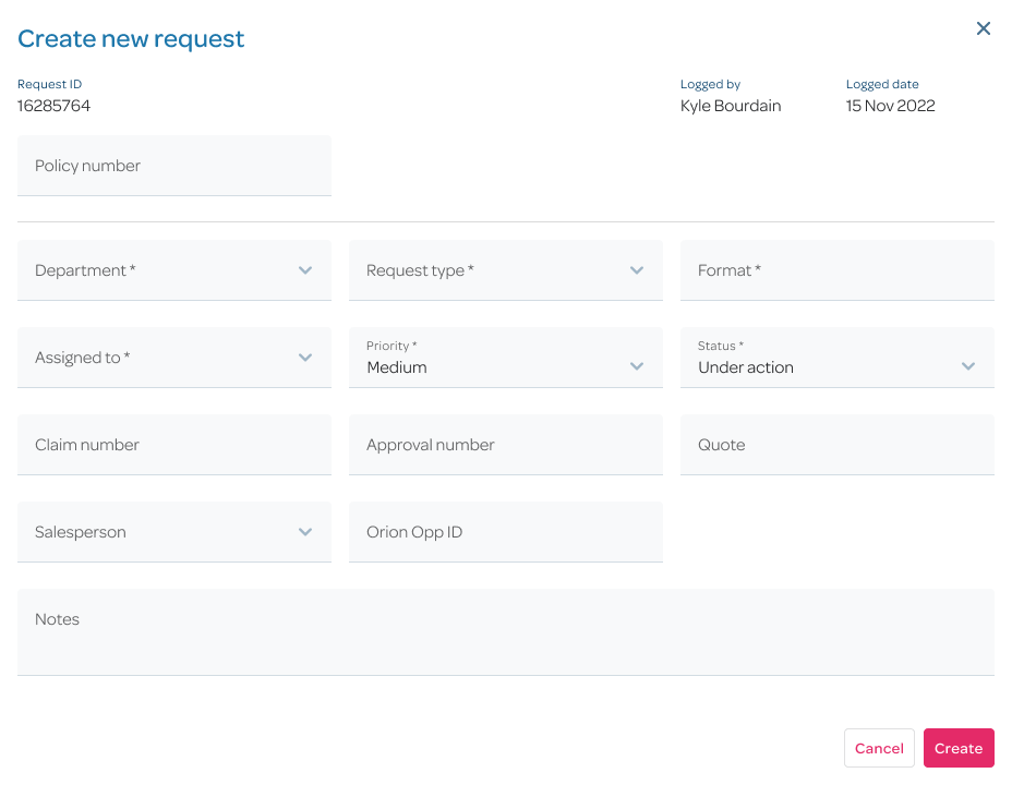
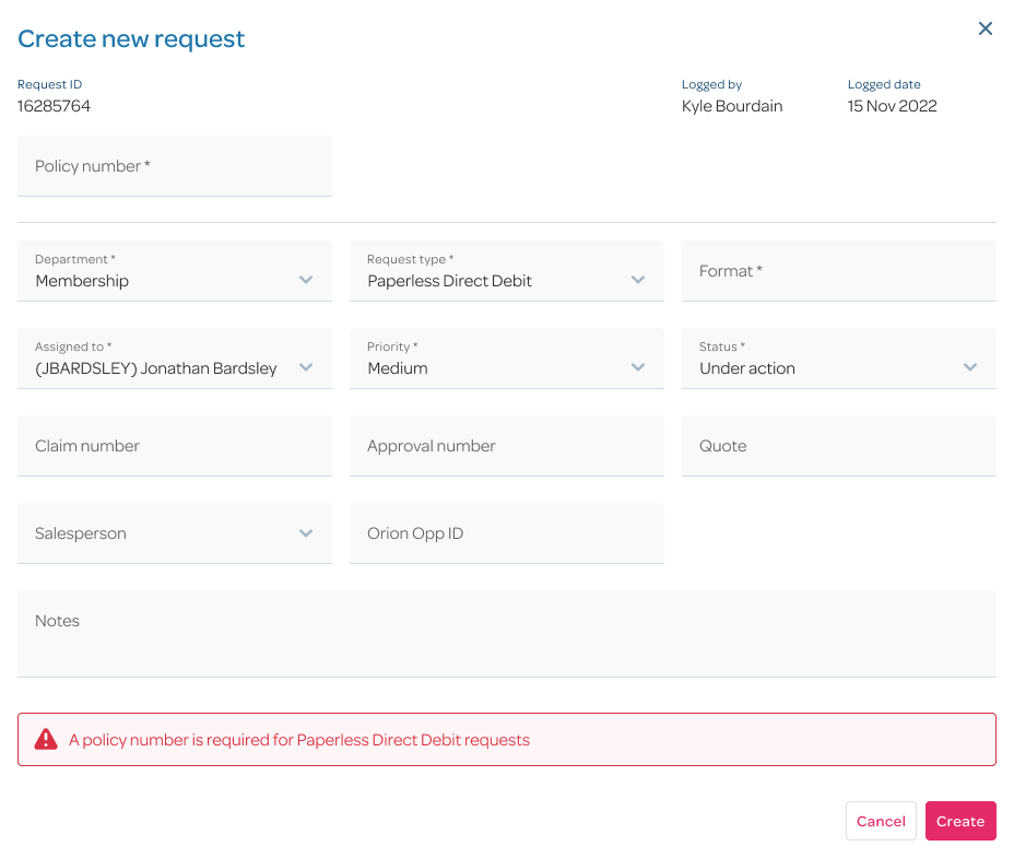
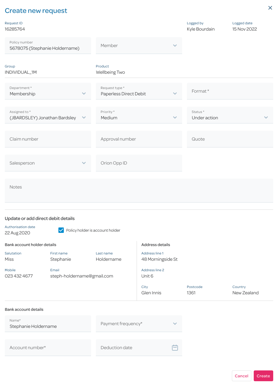
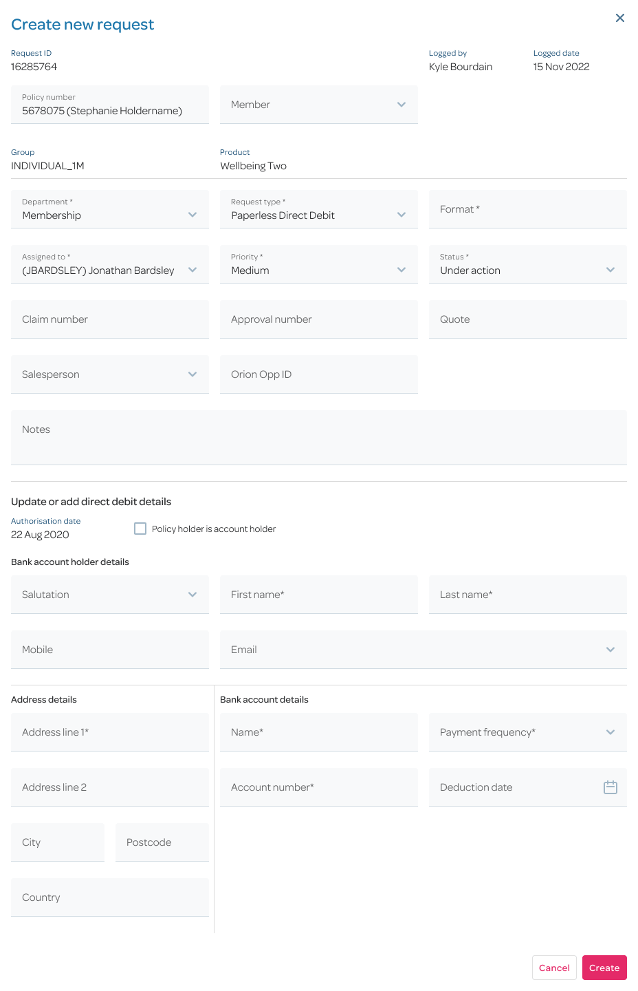
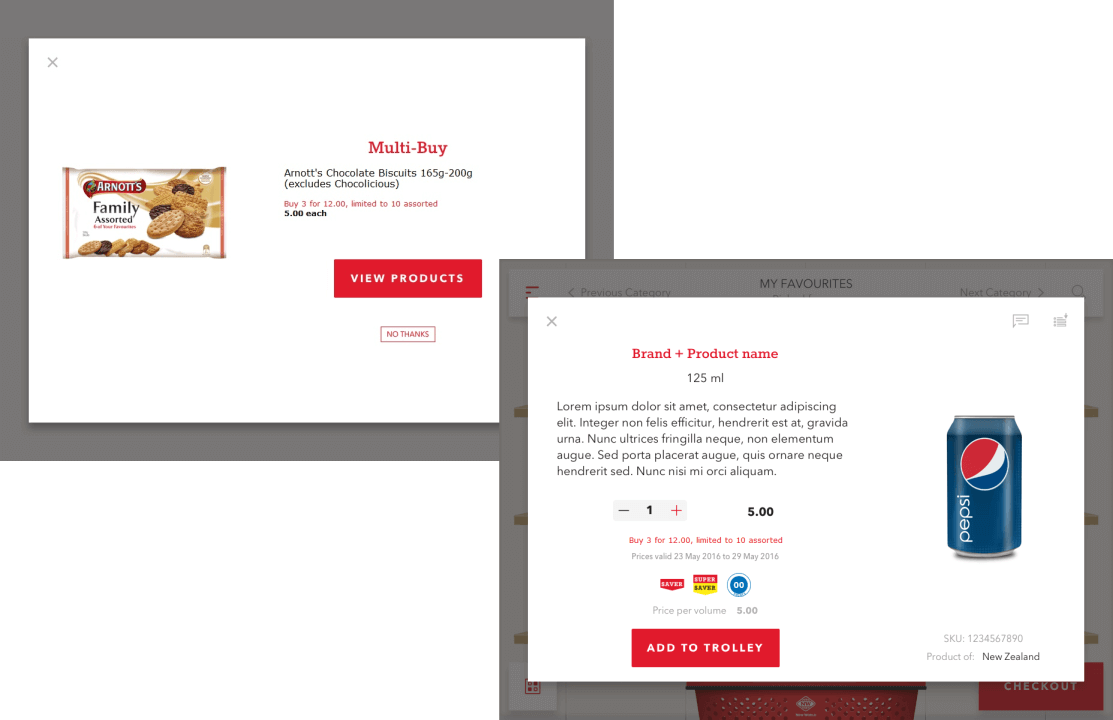
Within the screens, I used dynamic forms to display only content relevant to users' current task, reducing the need for them to switch between multiple pages, tabs, or modals. This example shows the modal journey of a user updating a customer's direct debit payment details.
Initial state of the modal for creating a new request.

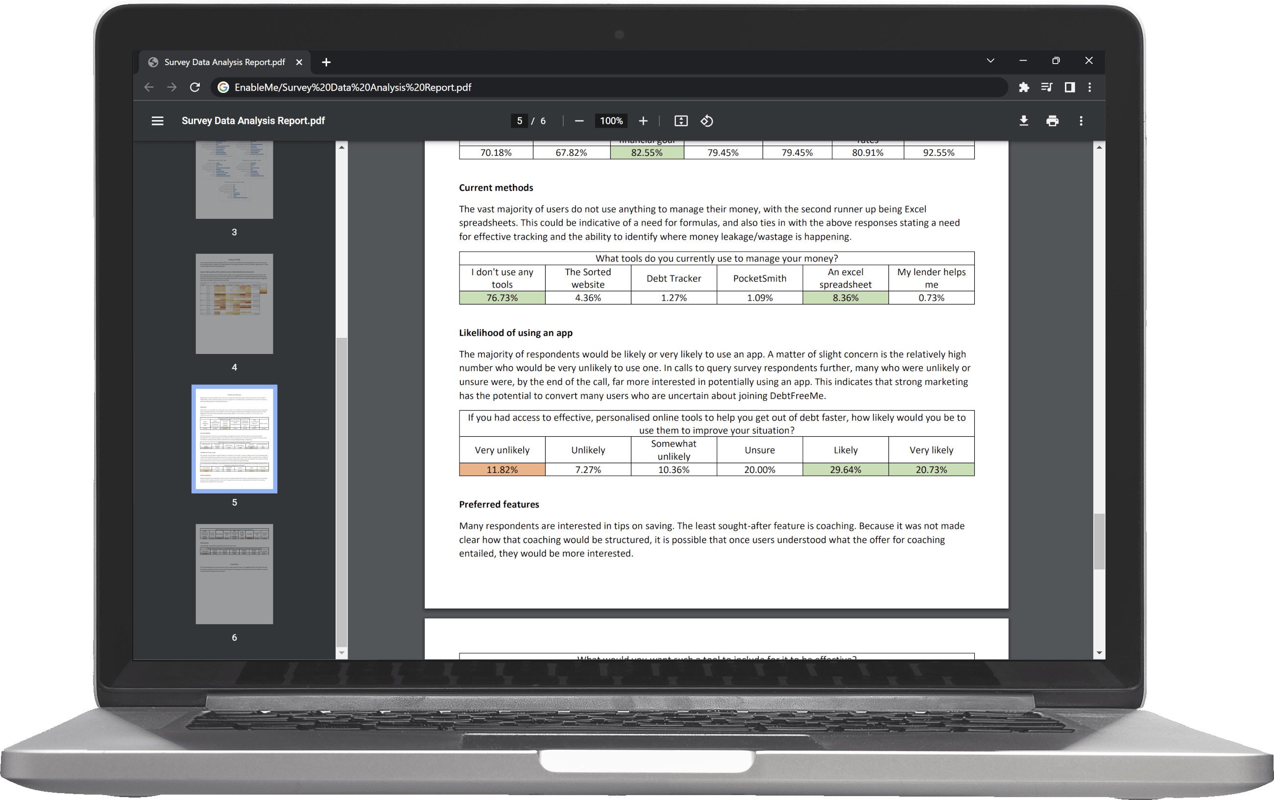
enableMe provides personal financial coaching and advice to New Zealanders, helping them grow their wealth and save for retirement. I contracted there for three months, performing UX Research for a new budgeting application.
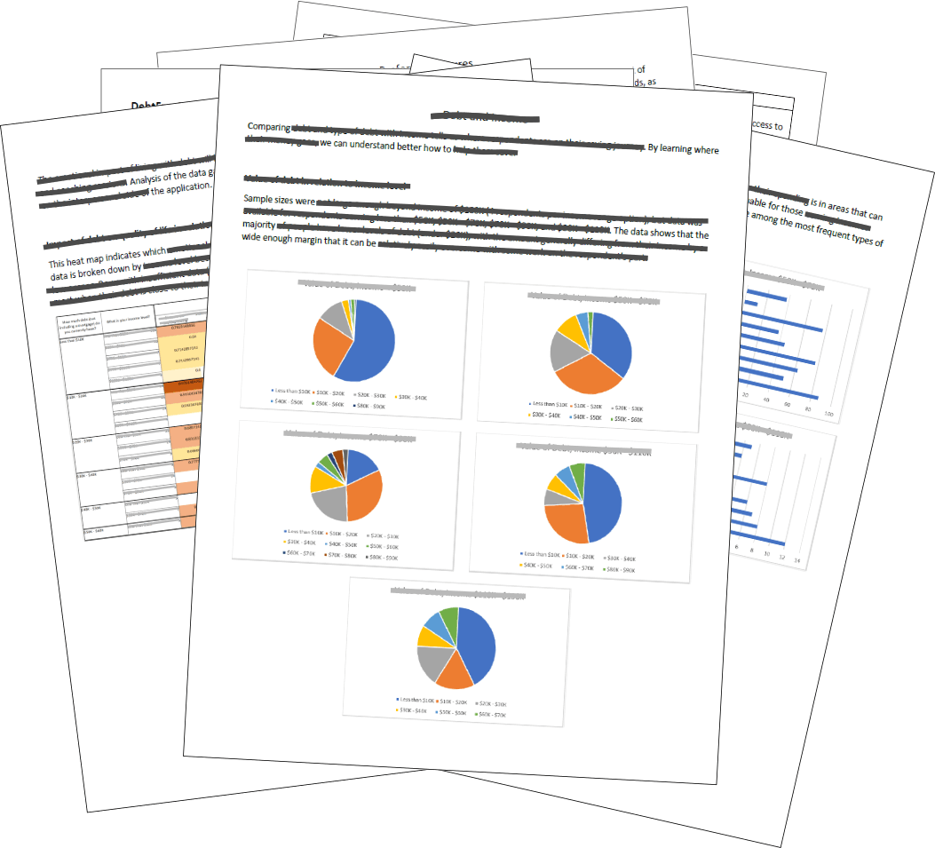
I analysed survey data from over 500 respondents regarding their current financial situation and conducted phone interviews with a sample group, collating the information into a report which I presented to the wider team.
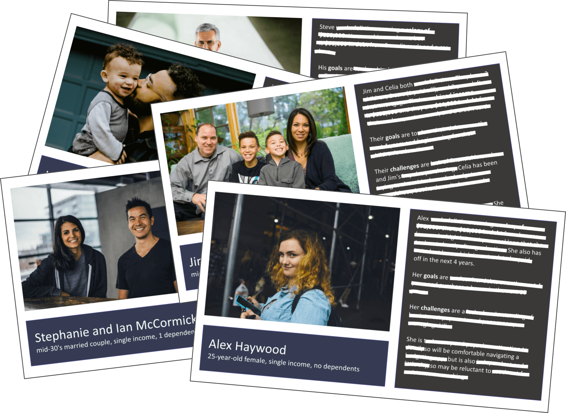
I also developed personas for five categories of possible users based on what I learned, and led a workshop where we discussed them before developing a brief for the team covering design criteria for the application.

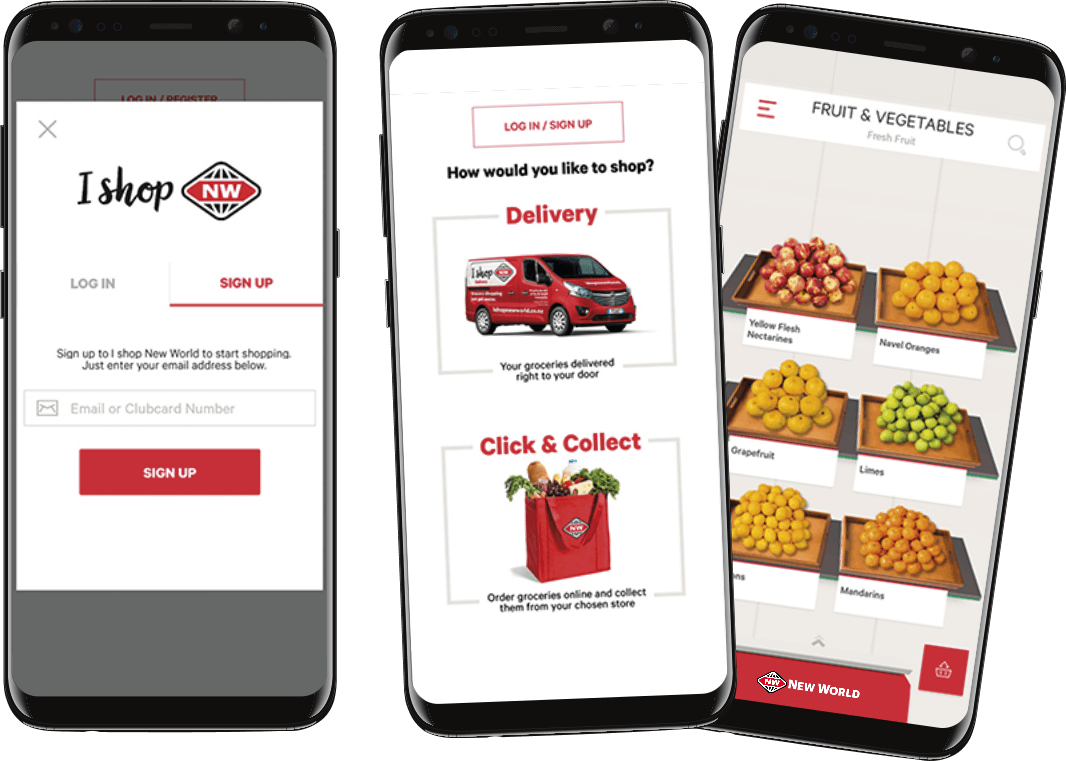
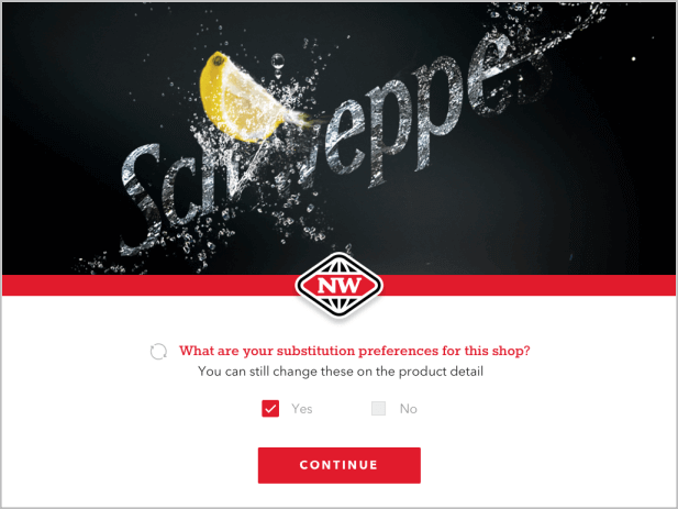
I led UX development for New World supermarkets' online shopping app, available on iOS and Android. One of my key tasks was adding user journeys for features unique to the brand, such as different types of sale offerings. I would meet with the executive team to determine the requirements for the new features, confirm their feasibility with the local development team, and then communicate these needs to our overseas developers. Once in development, I tested the solution and presented the result back to the executive team for final approval and release to production.
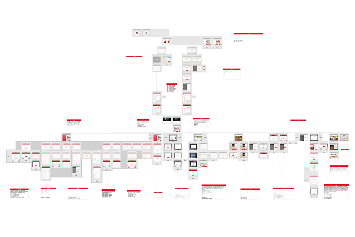
Final screenflow (view larger). After organising the existing journeys into categories like profile information, shopping lists, and order history, I constructed a screenflow covering all of the paths a user could take within the app.

© 2023 Liz Alonzi
Attributions:
Leaf designs: mariadetarosarinda •
Mobile phone template: vilmosvarga •
Tablet template: Freepik •
Monitor template: rawpixel.com •
Laptop template: customscene •
Verifier app photo: Warwick Smith for Stuff •
Call centre photo: rawpixel.com •
Safari desktop: Alexander Lazarev
All design assets are property of their respective companies