Tahi is an enterprise health insurance platform where customer service teams manage their work. The existing desktop software had reached the end of its technical life and was being rebuilt using React.
I joined a newly-formed design team as a product designer on a one-year contract, working alongside a permanent designer and another contractor. Together, we took over the modernisation: improving consistency, updating the user experience where we could, and advocating for critical interactions.
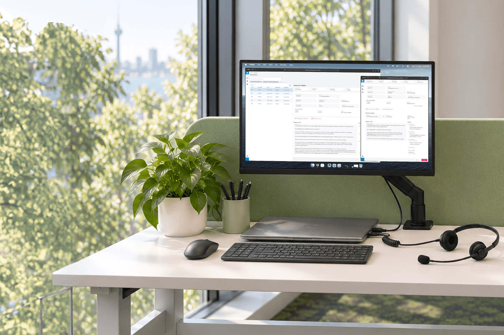
The handover documents we received were limited, so to understand the current state of the project, my design teammates and I ran workshops with the users and engineering teams.
Through them, we identified that inconsistencies in production were due to teams working from multiple incomplete design libraries. We consolidated these into a single Figma design system, then used Storybook to maintain a shared source of truth.
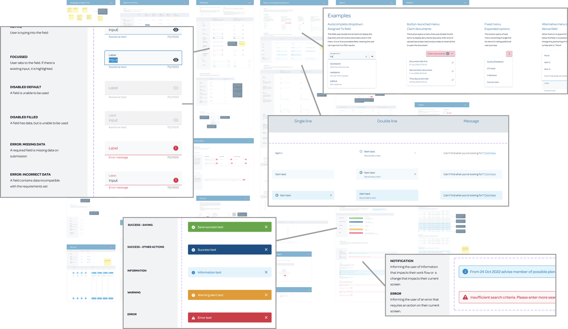
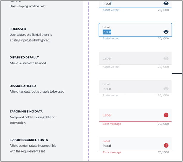
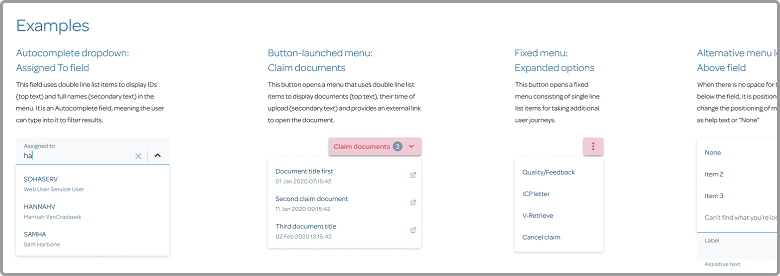
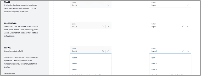
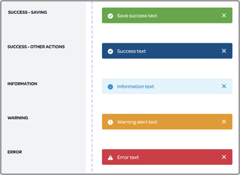
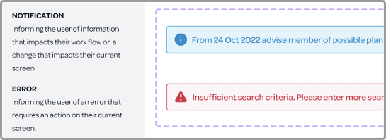
Tahi had to support complex, information-dense journeys. Consistent components gave users familiar patterns to rely on as they learned the new software.
Select a callout to view its documentation.
I shadowed users to identify which interaction patterns were most important to preserve, as well as uncover opportunities for improvement.
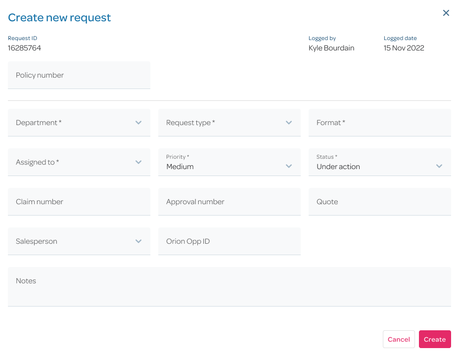
Creating requests was spread across several steps, with a “Next” button between each one. I brought the journey into a single dynamic form, reducing interactions and allowing users to retain context more easily.
New request: updating direct debit payment details
This is the initial state of the modal for updating a customer's direct debit payment details.
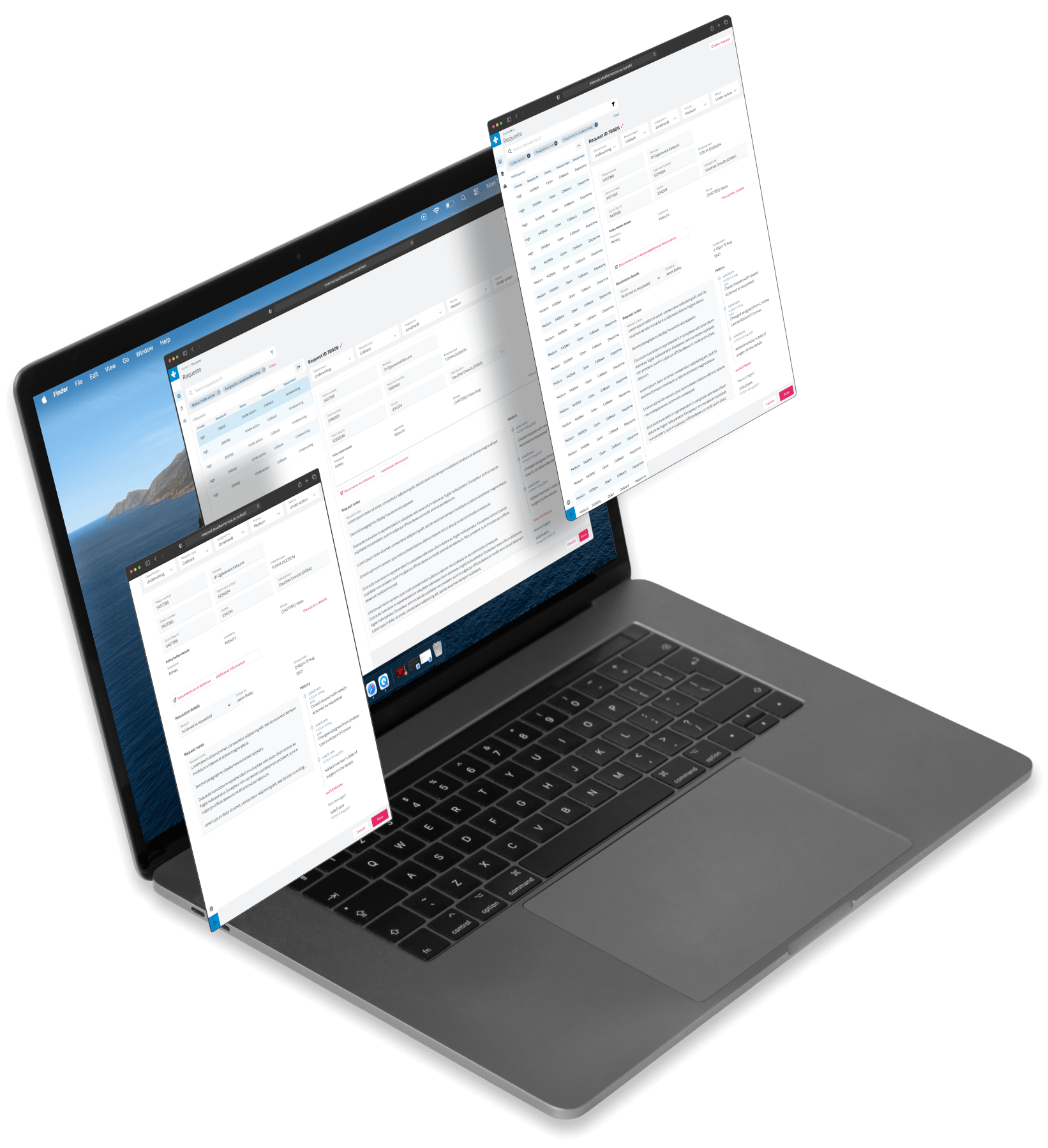
Users often resized and arranged windows side-by-side to compare information, but responsive behaviour wasn't in scope. We raised this with the business stakeholders and successfully advocated for it to be included.
Keyboard shortcuts were another important part of users' workflows, but they had been dropped due to conflicts with browser shortcuts. My software engineering background allowed me to work directly with engineers to distinguish which were genuinely blocked and which could be preserved.
Throughout my time on the project, I worked to foster a smooth transition to the new architecture: consistency in designs, considered improvements, and advocacy for what users needed.